If AI targeting is the engine of a modern push strategy, creative is the steering wheel. You can have perfect delivery timing, flawless segmentation, and a premium offer — but if your notification looks like every other one on the lock screen, nothing clicks. In 2026, with user attention shorter than ever and notification inventory more competitive than it’s ever been, creative quality is often the single biggest lever between a mediocre campaign and a breakout one.
Here’s what’s actually working on push creative right now — and what to stop doing immediately.
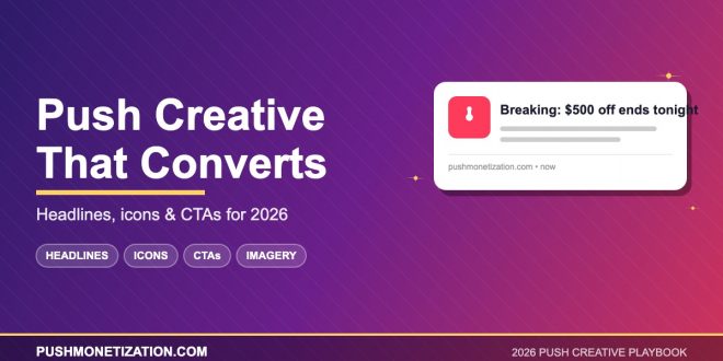
1. Write Headlines Like News, Not Marketing
The push notifications with the highest CTRs in 2026 don’t read like ads. They read like breaking news. “New report drops at 3pm” outperforms “Check out our report.” “Three players just changed the lineup” outperforms “Sports update.” Push lives in the same UI as genuine alerts from the user’s friends, banks, and news apps — so the copy that blends into that context wins. Marketing-speak sticks out in all the wrong ways.
2. Front-Load the Hook
Android truncates notification titles around 50 characters. iOS lock screens cut off sooner than you think. If your headline’s payoff is in the second half, half your audience never sees it. The rule: put the most compelling word or number in the first five words. “$500 off” in the lead beats “Save big on…” every time.
3. Numbers Beat Adjectives
“Huge sale” is a guess. “47% off” is a fact. Specific numbers outperform vague intensifiers across nearly every push vertical. This is even more true in 2026 as users become more skeptical of hype-driven copy. Specificity signals credibility — and credibility gets clicks.
4. Icons Are Half the Creative
Most publishers still treat the notification icon as an afterthought — often just their logo. That’s a mistake. The icon is one of only two visual elements the user sees, and a well-chosen contextual icon can lift CTR 20–40% on its own. Use icons that match the content (a red alert dot for breaking news, a cart icon for promos, a face for personal messages) rather than defaulting to a brand mark.
5. Hero Images Are Worth the Effort
The large image that appears on expanded notifications is optional — but neglected. In 2026, every high-performing push template uses one. Keep it simple: one clear subject, high contrast, minimal text (the system will show your text separately), and sized correctly for all major browsers. This is free real estate most publishers are still leaving empty.
6. Personalize the Salutation
Even a simple first-name token (“Sarah, your pick is back”) can lift click rates noticeably. In 2026, the best-performing notifications mix personalization tokens with behavioral ones: “Sarah — the Pixel 9 you viewed is $120 off.” This kind of micro-personalization used to require engineering resources. Modern push platforms generate it automatically.
7. Use Urgency Honestly
“Limited time” lost its meaning years ago. What still works: real deadlines with real reasons. “Ends tonight — inventory sold out last month” is honest urgency. “Hurry!” is noise. Users in 2026 have been trained to ignore fake scarcity, and platforms are increasingly penalizing senders who abuse it.
8. Test Emoji Placement — Carefully
Emojis can boost CTR in the right vertical (news, entertainment, e-commerce) and completely tank it in others (finance, B2B, luxury). The general rule in 2026: one emoji at most, placed at the start or end of the headline — never in the middle of a sentence. And test specifically against your own audience. Industry averages mean nothing here.
9. Match Creative to Device Context
A subscriber on a mobile lock screen, a desktop corner toast, and an Android notification drawer all see your creative differently. The best-performing campaigns now automatically adapt: shorter headlines on mobile, more detail on desktop, different CTAs based on device. This used to be advanced; in 2026 it’s table stakes.
10. Kill Low-CTR Creative Ruthlessly
The biggest creative mistake publishers make is falling in love with a notification. If a campaign’s CTR is below your network average for 48 hours, kill it — don’t optimize it. Your subscriber list is your most valuable asset, and every impression spent on underperforming creative is an impression stolen from a better one. The best operators in 2026 run aggressive creative rotation, not slow optimization cycles.
11. Refresh Before Fatigue Hits
Creative fatigue shows up in the data before it shows up in unsubscribe rates. Watch your CTR decay curve, not just your absolute numbers. When a previously top-performing variant starts slipping 10–15%, refresh it — don’t wait for it to fall off a cliff. Publishers who rotate creative weekly consistently outperform those who rotate monthly.
12. Let the Network Handle What It Can
The biggest 2026 shift: modern push networks automatically match creative elements (icons, images, headline variants, CTAs) to individual subscribers. Your job isn’t to design the perfect notification for everyone — it’s to provide a rich pool of creative building blocks and let the system assemble the winning version per user. The publishers adapting to this mindset are pulling ahead fast.
Closing Thought
Great push creative in 2026 isn’t about tricks, hacks, or clever headlines. It’s about respecting the subscriber’s attention, writing with clarity, and letting modern tools handle the optimization. The publishers nailing this are seeing click-through rates that would have looked like typos two years ago — because they’re treating creative as a discipline, not a checkbox.
Want your creative working this hard with zero manual lift? Plug into Push Monetization and let automated creative optimization handle the testing for you.