Alongside the big and accelerating way that web push notifications have bursts onto the scene, it would seem natural that a lot of brands and businesses have won big with it -and they have- but there is always room for improvement and we are here to help.
Look, you might be seeing success in a nice capacity already with your web push notifications. It’s not exactly hard to see the results and get excited, but there is always something that you might be missing in order to make those good results extraordinary!
In this article you will learn what to do -and just as importantly- what to avoid doing as far as the way you are enticing your audience to subscribe in order to get as many people on board as possible. Getting those subscribers for your web push notifications can be an art, but it doesn’t have to be complicated in order to score big. Let’s dig in.
- Don’t Do What Everybody Else Is Doing
So, this might seem a little bit counter-intuitive and if this is the way that you are currently trying to get subscribers, we won’t judge you, because we have ALL been there. However, once you know what your illness is and if you still do the things that brought it to bear, that’s on you.
The most usual and therefore, least successful way that people set up their opt-in page is like this:
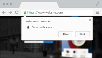
Again, if this is the way you’re rolling right now, you are by far not alone. Going with the default options are almost never a good thing and that goes in general, but specially with something with so much potential as web push notifications.
If your users see that you don’t have anything special going on, why should they bother adding yet another notification to their pile? No, that’s not the way that it should go. Instead, what you should do is offer something special that calls for their attention and makes them click on that beautiful “allow” button.
- Make Your Opt-In Screen POP
 Whether we like it or not, it’s very difficult to deny the fact that things that look and feel different get different results. Obviously, you need to be the different in order to get those different results that we are talking about.
But there’s something that you need to know, the why to our how, and that’s the fact that your opt-in screen is pretty much your presentation card to the customer. As with anything else on your website, they are part of your marketing and they should be taken seriously by you in order to be taken seriously by the users.
As people, we become see things less the more familiar we are with them. Therefore, if you are using the default opt-in screen, chances are that it could very well just pass your users by because they are so used to see them. Obviously, this is not an optimal strategy.
When you make your opt-in screen unique, you are giving the users the ability to enjoy a new sight and put you on a different place mentally compared to all the other sites that use the default opt-in screen. This is definitely the smart way to go as far as this part of the process is concerned.
The dual nature of default opt-in screens is also tiresome to some people. You get asked whether you want to subscribe to that page or not, it’s a yes or no question and if the user accidentally clicks “deny” (which is the exact same as saying no) then you are out of luck pretty much for future requests.
- Time Your Requests Properly
Have you ever gone to a website where you not only got the push notification request notice that we just spoke about, the default one,  but also that it was sent to your right away? I bet you couldn’t wait to click on “deny”, could you?
Well, that’s understandable, you were being asked to do something that you did not know why you would want or at least why you would want it so quickly.
It’s like asking someone to marry you on the first date. I mean, it’s likely that it would work with a portion of the population, but that does not make it a good idea by itself.
There are several reasons why you should time your requests properly, but amongst the most pressing ones is the fact that people want to know what they are getting when they are getting it. Explain why they should click on the “allow” button in few words and we recommend doing it with a notorious graphic, again, all in the spirit of standing out from the other requests that they get.
- Show Them What They Are Getting
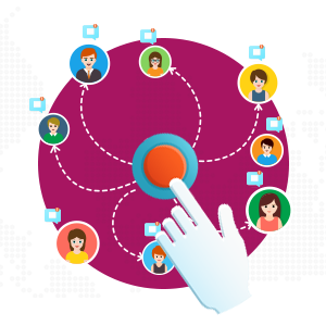 This is basically our favorite method because we have seen the kinds of results that you can expect using it and at the same time, it’s one of the least used methods by businesses, websites and marketers alike. As you can imagine, it has very little to do with the default methods that most use in order to try and get web push notification subscribers.
In order to let the user have make an informed decision, you could show them what they are getting beforehand. But how? Well, there are a couple of ways.
The first way is to use a “tour”. Normally and within our experience, we have found that video tours work the best. In it you should show the kind of benefits that they are getting from clicking on “allow” or before they accept your request to send them web push notifications.
You have heard about how a picture is worth a thousand words before, right? Well, it is in that sense that a video is worth a million or more. A visual element going along with a request will always yield superior results and this is true no matter what you are talking about.
The second way to entice users is to use a permission screen before you actually make the request. This is definitely one of the most encouraging and smart ways that you can go about setting up things up for yourself.
These kind of permission screens let the users know what they are getting as a benefit for subscribing or allowing you to send them web push notifications. Let us show you a good example of the kind of permission screen that we are talking about:
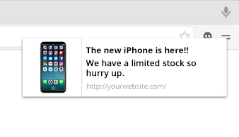
As you can tell, it is all very streamlined and direct, without being pushy (see what we did there?) All joking aside, you will be helped and see a noticeable increase in the conversion rate that you have just by using these kinds of tactics.
- Bribe Them Ethically
This is yet another strategy that a lot of people miss. We all like free stuff, right? They say that there is no such thing as a free lunch, well you might as well prove people wrong and get something while you’re doing it.
The ethical bribes that we are talking about can vary in size, but they generally fall within a few categories such as digital downloads, early access to events or content that other people will have to wait to get their hands on, advice or tips on a specific topic or series of topics, coupons that they can only get by clicking on the “allow” button and that are exclusive to the people who are subscribed to your web push notifications, and so on.
No matter which of the 5 strategies you use, it would be a very smart idea to do it the right way. In fact, it would be best if you could implement all 5 strategies together, but no matter what you do, always remember to put the cart after the horse and not the other way around.
Since you have now learned that using the default web push notification methods that everyone else uses will yield you mediocre results, you must also learn the golden rule, it is 10 times smarter to ask for the user’s permission to send them web push notifications AFTER they have seen your strategies implemented, and not before.
See, if you ask for them to opt-in at the beginning, all that will happen is that you will alienate a lot of people and get more “deny” clicks than you deserve. Know when the right time to ask and everything will be great.
Another important thing to remember is that you should gather data and analytics as time goes by. In fact, you should (and do need) to keep a close eye on this precious data as it will enable you to cater the opt-in screen experience to your specific audience, thus converting even more people to your end. This, my friend, is what is known as a virtuous cycle.
Too Long; Didn’t Read:
- Don’t use the default opt-in screen to ask the user if you can send them web push notifications, almost everyone is doing that. Don’t be “everyone else”.
- Take the time to make your opt-in screen stand out in the user’s eyes, you will be remembered more and get more conversions.
- Use a tour video or visual tour of the benefits that the users will get once they subscribe to your website.
- Consider using a permission screen before the users see the actual opt-in screen. It’s respectful to the users and their time.
- Be careful with the placement of any visual elements that you use, they will influence the decision made by the user.
- Bribe the user ethically by offering them a discount code, digital download, early access or anything else that they could possibly consider interesting as a way to jump on your bandwagon.
- Gather analytics every step of the way, use them as a jumping off point in order to test and experiment with different kinds of opt-in screens, video tours, ethical bribes and more.
- Time your opt-in screen perfectly or at least, avoid showing it right away, this is a common mistake that kills more possible converts that you could possibly imagine.
 Push Monetization Blog

